Cheez Whiz, a processed cheese sauce or spread sold by Kraft Foods that I was tasked to redesign for a school project. The project requirements consisted of redesigning the Logo as well as designing a new Label for the product.
Problem
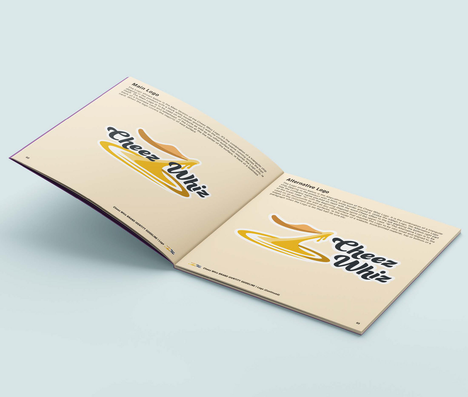
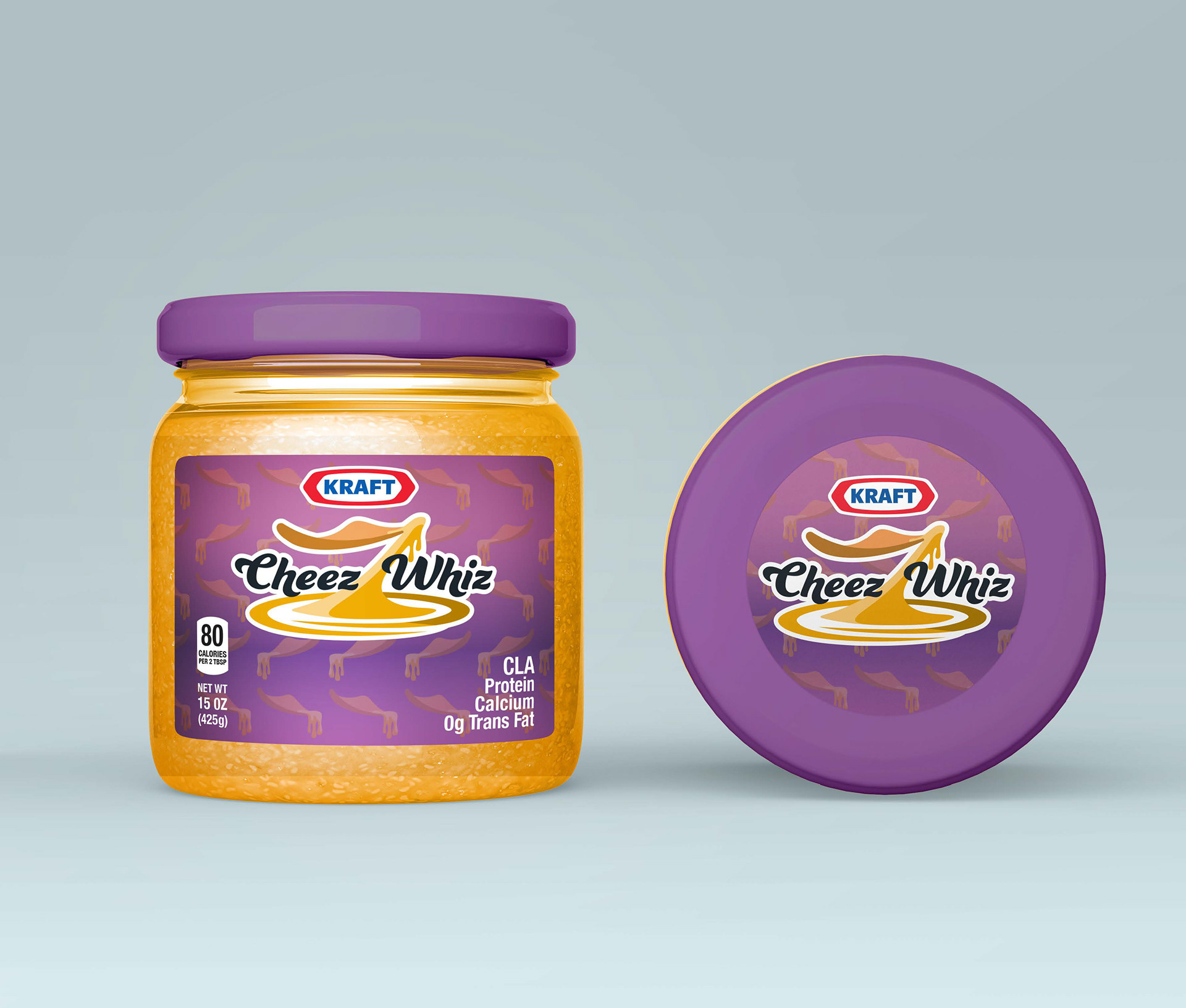
I am to create a memorable redesign of the Cheez Whiz Logo but stay true to the brand. After the Logo has been created, I am to then create a Label that will go on the Cheez Whiz product packaging, a jar. An additional objective was to create a Brand Guideline that will specify how the new Logo is made and how it should be used by future designers.
I am to create a memorable redesign of the Cheez Whiz Logo but stay true to the brand. After the Logo has been created, I am to then create a Label that will go on the Cheez Whiz product packaging, a jar. An additional objective was to create a Brand Guideline that will specify how the new Logo is made and how it should be used by future designers.
Solution
Not having many restrictions throughout this project, I was able to come to a solution fairly quickly. After a few sketches of both Lettermark & Logomark Logos, I cam to a conclusion of creating what appears as a Divisible Logo but with the intention of the Letter half of the Logo to stay in the middle and fill in the silhouette of the entire Divisible Logo as a whole.
Not having many restrictions throughout this project, I was able to come to a solution fairly quickly. After a few sketches of both Lettermark & Logomark Logos, I cam to a conclusion of creating what appears as a Divisible Logo but with the intention of the Letter half of the Logo to stay in the middle and fill in the silhouette of the entire Divisible Logo as a whole.
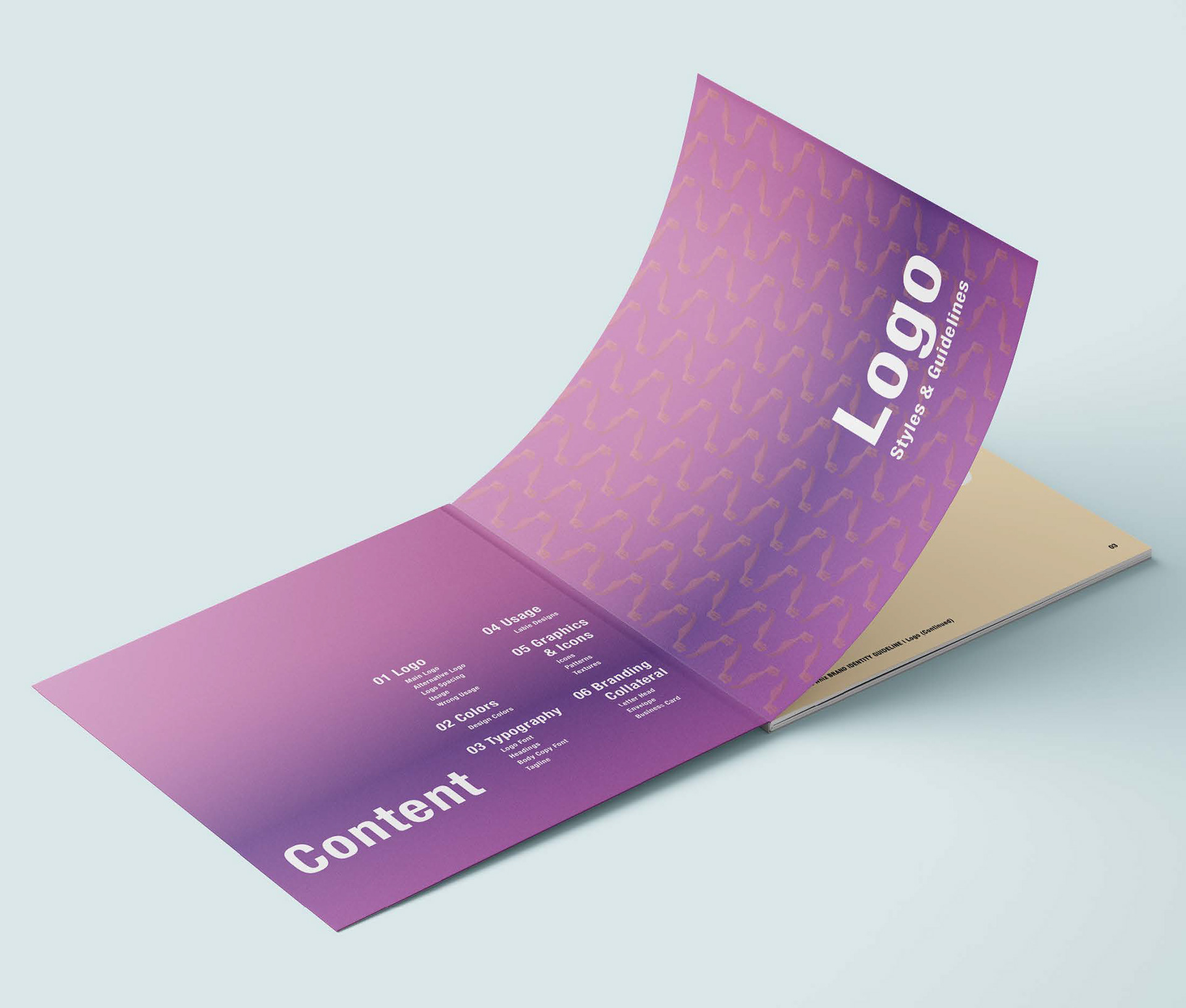
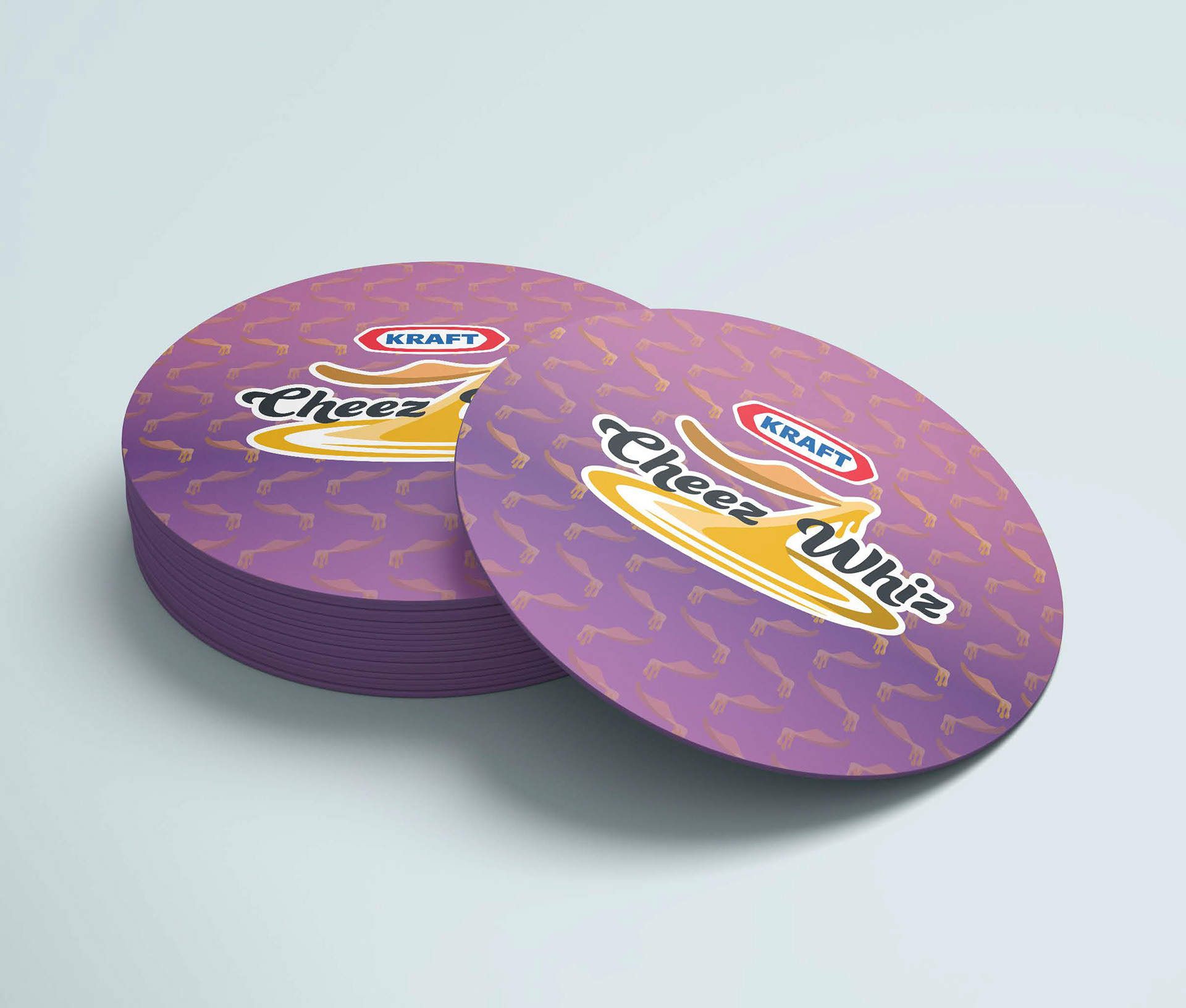
The Redesigned Logo consists of a chip pulling the cheese from the surface of the jar. The surface of the jar also acts as the base of the Logo. The name then appears in the middle of the Icon to fill up the negative space. The chip Icon is pretty important because it's a reoccurring graphic that appears throughout the brand designs as a pattern in low opacity i.e the Label and the Title page on the Brand Identity Guidelines.
